
Color Order of the Phoenix
Digitally, I removed the lower box, and extended the upper box to make it wider. The phoenix clipart was also resized to fit the box. I found a better font that is a bit more decorative than the basic Gothic style. It is called "Broken Planewing" which I found at Lord Kyl's Fonts. The page was then printed onto 90 lb smooth cardstock at Kinko's.
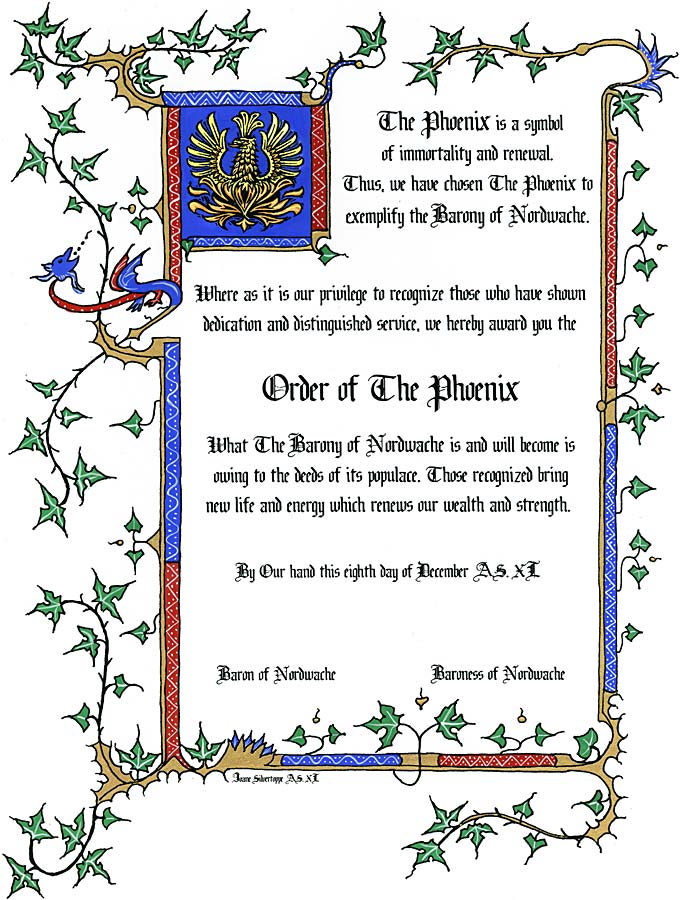
I then hand painted the image using Windsor & Newton's gouache in Ultramarine, Primary Red, Permanent Green Middle, Primary Yellow, Zinc White (for mixing), Permanent White (for highlights), and Gold (Imitation).
I then rescanned the image into my computer, and cleaned up the image digitally, either erasing extra blobs of color or specks on the white backgroun, or redoing the black. Minimal editing was otherwise done, as I wanted the hand painted imperfections in the colors to remain. The multiple copies of this page were printed in color, again at Kinko's.